Attrition Analysis Dashboard
View Document Details
- Topic Revised: 2024 04 30 T12:44:10 UTC; April 30, 2024 at 12:44:10
- Topic Created: 2024 04 26 T12:40:51 UTC; April 26, 2024 at 12:40:51
- Help System Last Build: 2024 05 03 T11:59:15 UTC
Summary
The Attrition Analysis dashboard offers a comprehensive insight into the members who have chosen to discontinue their memberships within a specified date range. This analytical tool equips you with crucial information about the impact on recurring dues drafts, along with trending data.
By utilizing this report, you can proactively assess and adapt your business model to ensure its sustainability.

Commerce and iSeries Dashboard
This dashboard supports both billing systems, Commerce Transact and iSeries.
When to Use
Use the Attrition Analysis dashboard as a vital tool for member retention and business sustainability. It provides actionable insights into attrition patterns, member behavior, and revenue impact, allowing you to make strategic decisions that foster member loyalty and maintain a healthy financial foundation for your club.
Below are a few examples of using this dashboard.
-
Retention Strategy Enhancement
-
Business Model Adaptation
-
Trend Identification
-
Membership Lifecycle Understanding
-
Revenue Forecasting
-
Member Feedback Incorporation
-
Member Communication Strategy
-
Staff Training and Support
TIP! Use the Advanced Filters option to customize the dashboard by membership type, member status, status reason, gender, primary member, and age range. When you apply advanced filters, charts are automatically updated.
Key Performance Indicators (KPIs)
The following values are shown on the dashboard.
Attrition Count
Shows the number of canceled, transferred out, expired, and RFC members for the selected date range. This number is compared to the attrition count of the prior month and prior year.
Attrition %
Shows the percentage of active members who canceled, expired, or changed to RFC status.
Attrition Percentage Calculation

This percentage is compared to the attrition percentage of the prior month and prior year.
Attrition Amount
Shows the current recurring billing amount of canceled, expired, or RFC memberships. This amount is compared with the attrition amount of the prior year and prior month.
Billing % Affected
Shows the billing amount canceled divided by total invoice amount attempted.

This percentage is compared to the billing percentage of the prior month and prior year.
Pending Cancellations
Shows the number of members who will be canceling.
Charts
Several charts have a drill-through feature, allowing you to view specific details about the data. To drill through to a detailed report, right-click the chart item, select Drill through, and select a desired detail option.
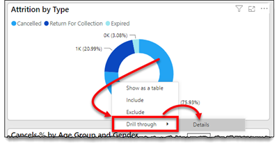
An asterisk (*) denotes the chart has drill-through reports.
The following charts are related to the KPI values.
Attrition by Type*
Shows the number of canceled, expired, or RFC memberships. Right-click a chart area to drill-through to the negative impact details.
Attrition % Trend
Compares the previous 13 months negative impact with the prior year negative impact. Changing the date range filter does not affect this item.
Cancels % by Age Group and Gender*
Shows canceled members by age and gender.
Cancel by Reason
Shows canceled members, categorized by the reason they canceled. As shown below, select the icon to expand or collapse the additional data. 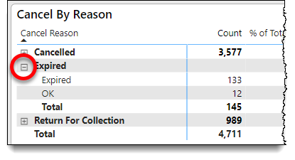
Essential Definitions
Attrition
A member who goes from active to inactive in the organization's database. This counts as a lost member unit and dollar amount from the recurring membership draft. The status type of the member will be one of the following:
- Cancel - Canceled membership agreement in Membership. This is typically a member request.
- Expire - Non-renewed membership. The membership agreement has reached its term and is not renewed in Membership.
- Return for Collection (RFC) - The process used when the membership agreement is 90+ days past due in Membership.
The status date is used to identify the date the member changed to inactive.
Chart
Key Performance Indicators
Prior Month
Prior Year
Illustrations
