Member Check-In Analysis Dashboard
View Document Details
- Topic Revised: 2024 04 30 T12:44:10 UTC; April 30, 2024 at 12:44:10
- Topic Created: 2024 04 26 T12:40:51 UTC; April 26, 2024 at 12:40:51
- Help System Last Build: 2024 05 03 T11:59:15 UTC
Summary
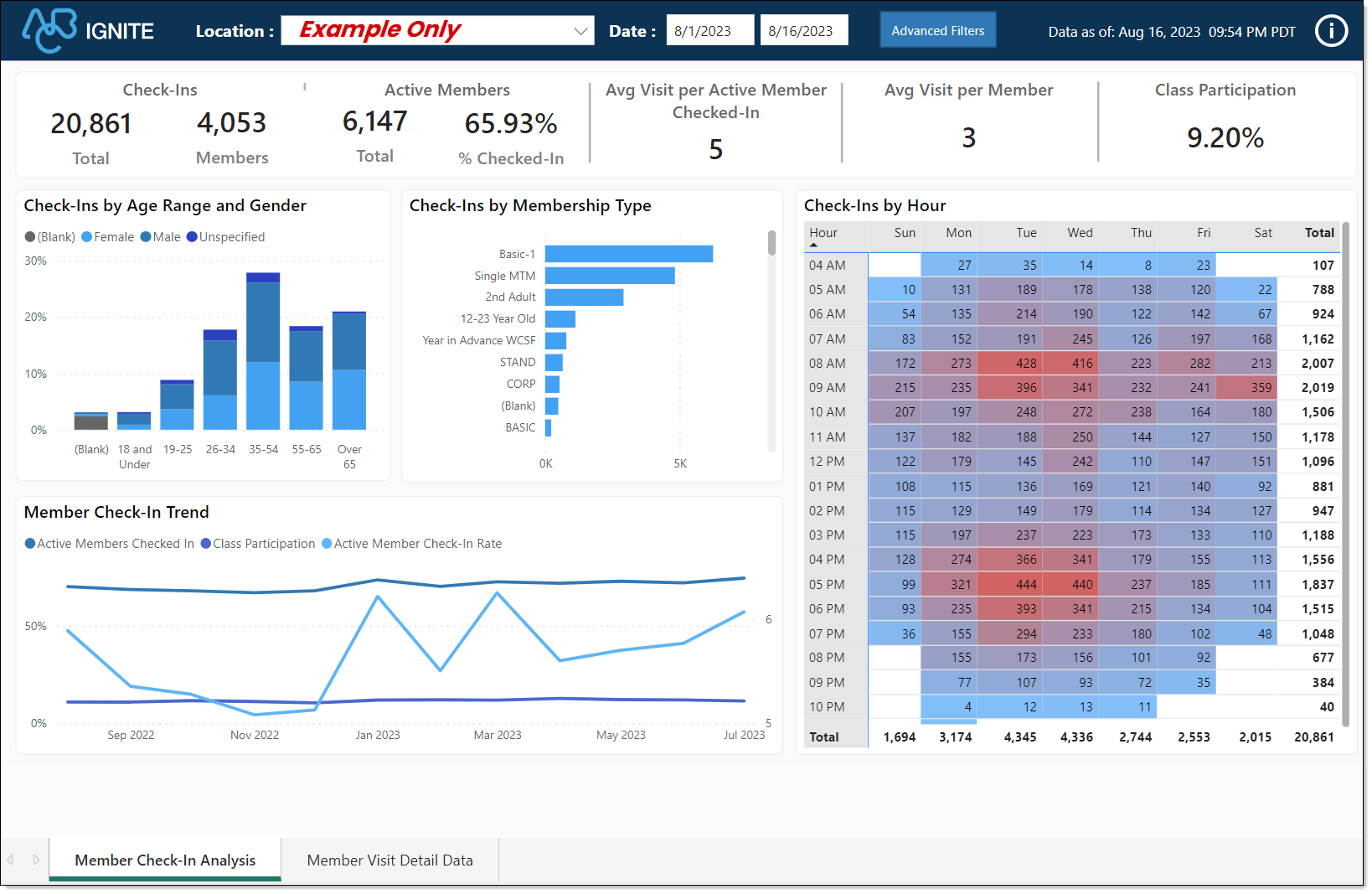
The Member Check-In Analysis dashboard offers a comprehensive view of various aspects related to member check-ins at your club.
This analytical tool provides insights into patterns, trends, and details associated with member visits, ensuring that you can effectively monitor and optimize club operations to meet member needs.

Commerce and iSeries Dashboard
This dashboard supports both billing systems, Commerce Transact and iSeries.
When to Use
Use the Member Check-In Analysis dashboard as a tool for optimizing club operations, enhancing member experiences, and making informed decisions about resource allocation and engagement strategies.
By examining check-in trends and related details, you can ensure that your club provides a seamless and satisfying experience for all members.
Below are a few examples of using this dashboard.
-
Operational Efficiency
-
Resource Allocation
-
Member Engagement
-
Member Behavior Insights
-
Retention Strategies
-
Membership Offerings Optimization
Key Performance Indicators (KPIs)
Key Performance Indicators
This dashboard includes the following key metrics and charts.
Key Performance Indicators (KPIs)
-
Check-Ins: Shows the total and unique count of check-ins for the selected date range. This also includes multiple check-ins for a member.
-
Active Members Checked-In: Shows the percentage of active members checked in to the club for the selected date range.
Calculation

-
Average Visits per Member that Checked-In: Shows an average of how many times a member visits the club.

-
Avg Visit per Member: Shows an average of how many times all active members would have visited the club based on the total check-in count for the chosen date range.

-
Class Participation: Shows the percentage of members who participated in a class.
Charts
Chart
Check-Ins by Age Range & Gender: Shows the total number of check-ins, grouped by age and gender, for the selected date range.
Check-Ins by Membership Type: Shows the number of check-ins by membership type. Hover the mouse over an item to view details, or right-click an item and select Drill through to open the detailed report.
Check-Ins by Hour: Shows the total number of check-ins, grouped by hour and day, for the selected date range.
-
White: An empty value (no member check-ins occurred).
-
Blue: The lowest value (the fewest number of member check-ins).
-
Red: The highest value (the most member check-ins)
Member Check-In Trend: Shows a 12-month trend of active members checked-in, average visits per member that checked-in, and class participation.
Use the Advanced Filters option to customize the dashboard by membership type, gender, check-in status, check-in message, alert check-ins, and remote check-ins.
Essential Definitions
Check-In
Class
Illustrations