Interacting with Data
Active Reports offer analysis tools comparable to those in popular spreadsheet applications.
When you use analysis tools such as charting and calculations, the Active Report uses any filters you have in place.
For more information, see the following sections.
- Adding Calculations to Columns
- Removing all Calculations from Columns
- Changing how Calculations Display with Filters
Charting Data
You can view your Active Report data as a line, bar, scatter, or pie chart.
You can make multiple charts from the same Active Report simultaneously.
Making a Chart
Making charts is quick and easy. You start with the menu in the heading of the column you want to chart, and then make a few quick selections.
Use the following instructions to make a chart from a column of data.
To make a chart from a column of data:
- If necessary, apply any filters to the report.
- Click the down arrow in the heading of the column with the information you want to chart.
- Select Chart.
- Select a field to use in sorting the data.
Learning More about Chart Data
Move your mouse over a section or point on the chart to get a data tip. Here is an example of a data tip for the Insufficient Usage field in a chart comparing cancel descriptions.

Use the following instructions to show data tips.
To show data tips:
- Move your mouse over a section or point on a chart to see a pop-up with information about the data.
- In addition to showing data tips, you can display a smaller table with only the charted data. Move your mouse over a section or point on a chart to see a pop-up with information about the data.
- Charts include a toolbar. Click
 to see a table of just the information used
in the chart.
to see a table of just the information used
in the chart.
Here is an example of a rollup table for the Cancel Description chart referenced above.

Linking Charts to Filters
Filters and charts can work together. Sometimes you may want the chart to change as you adjust filters; at other times you may want to keep it frozen to its original filter.
Use the Freeze/Unfreeze button ( /
/ ) in the chart toolbar to set whether
a chart is affected by filter changes.
) in the chart toolbar to set whether
a chart is affected by filter changes.
- Frozen charts
(indicated by ) use
the filter in place when the chart was originally created. If you
change the filters on the report, the chart stays the same.
- Unfrozen
charts (indicated by ) change when
you change the filters on the source report.
To change a chart as you change filters:
- Click the Freeze/Unfreeze button (/) in
the chart toolbar.
Using Data Visualization
Data visualization lets you quickly compare the values in numeric columns. Selecting visualization for a column adds bars showing the relative value of the data of the column in the chart itself.
Here is an example of a report with the Payment Amount field visualized.

Use the following instructions to add visualization to a column.
To add visualization to a column:
- Click the down arrow in the heading of the column you want to visualize.
- Select Visualize.

The Active Report adds visualization bars to the right of the column.
Performing Calculations
You can perform calculations on the data in an Active Report. Calculations you can perform include counts, sums, averages, minimums, maximums, and percentages. (For more information, see Calculation Types.)
Adding Calculations to Columns
You can apply more than one calculation to a column. Here is an example of a report that uses both a Sum and a % of Total calculation.

Use the following instructions to add a calculation to a column.
To add a calculation to a column:
- Click the down arrow in the heading of the column.

- Select Calculation.
- Select the type of calculation.
The Active Report shows the results of the calculation.
Removing all Calculations from a Column
Use the following instructions to remove all calculations from a column.
To remove all calculations from a column:
- Click the down arrow in the heading of the column.
- Select Calculation.
- Select Clear.
Changing how Calculations Display with Filters
When there is a filter in place for your report, you can change which data is used for the calculation: (1) the filter (or subtotal) information, (2) all of the report data regardless of filters, or both.
| Data Used | Example Calculation |
|---|---|
| Subtotal and total |
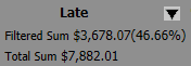
|
| All rows, regardless of filter |
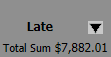
|
| Only filtered rows |
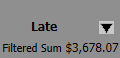
|
Use the Total button in the pagination bar at the top of the report to switch among the different methods. The button only appears when you have a calculation in place.
Here is an example of the Total button.

Use the following instructions to change how filters affect calculations.
To change how filters affect calculations:
- Apply a filter and at least one calculation to the report.
- Click the Total button until the report uses the calculation method you prefer.